
The Way We Code Matters! It might seem harmless tossing in a few styles here and there, but trust me, without a game plan, your stylesheet can spiral into a spaghetti mess faster than you think.
CSS is the silent architect of user interface, and it deserves more credit and a lot more structure. As teams grow and projects scale, clean, maintainable CSS isn’t just nice to have—it’s survival.
This post is all about CSS maintainability: bringing down the chaos and taking control over your CSS, ensuring a reliable styling foundation.
-
Keep it dry (don’t repeat yourself)
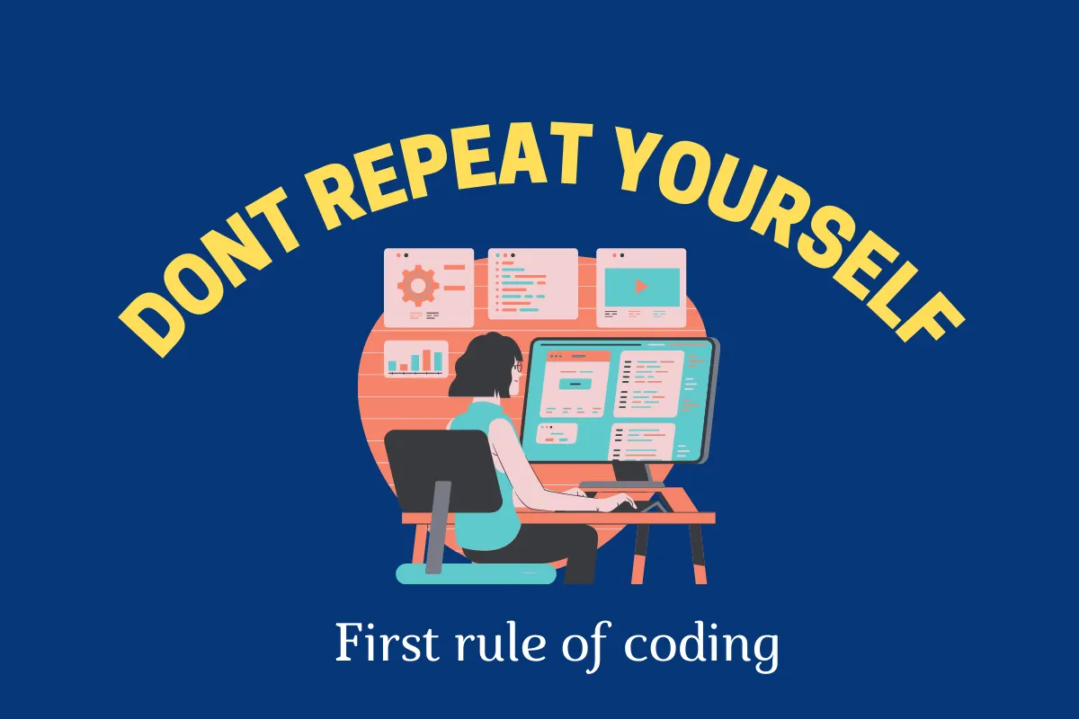
Repeating the same styles in multiple places makes your CSS harder to maintain. If you plan to alter the style, you will update in various locations, increasing the risk of errors and inconsistency.
Adapting DRY ensures that changes are centralized, reducing redundancy and improving maintainability.
/* Repeated styles - bad practice */
.header { color: #333; font-size: 16px; }
.footer { color: #333; font-size: 16px; }

/* DRY approach */
.text-standard { color: #333; font-size: 16px; }
.header { @extend .text-standard; }
.footer { @extend .text-standard; }
In this example,
- Reusability: By creating a reusable class (.text-standard), both .header and .footer share the same styles. This reduces redundancy, making future changes faster and more efficient.
- The @extendsyntax is specific to SASS and requires a build step to compile down to regular CSS. However, you can still practice DRY in vanilla CSS by creating a shared class (e.g., .text-standard) and applying that class alongside other classes in your HTML elements:
<!-- DRY approach -->
<header class="header text-standard">...</header>
<footer class="footer text-standard">...</footer> -
Embrace the Power of Modularity
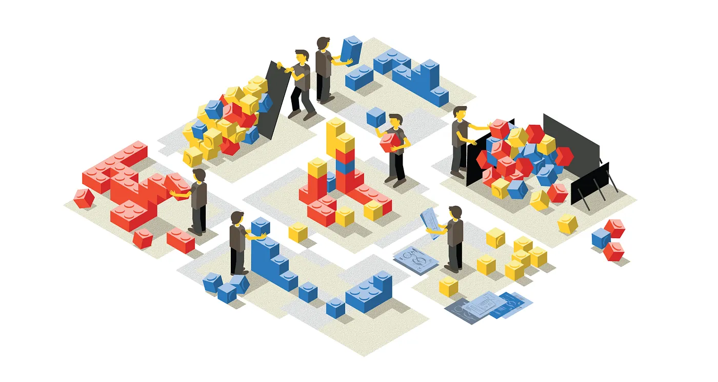
CSS should be modular, i.e., styles should be segregated into reusable components. Each component should be self-contained and shouldn’t unintentionally affect other parts of the site.
To achieve this, adapt methodologies such as Atomic Design or ITCSS (Inverted Triangle CSS) to help structure your code into manageable modules.
<div class="card">
<div class="card__header">Card Title</div>
<div class="card__body">This is the card content.</div>
<div class="card__footer">
<button class="card__button">Read More</button>
</div>
</div>
.card {
/* Base card styling: background, border, padding */
}

.card__header {
/* Styling for the card header (e.g., font size, weight) */
}

.card__body {
/* Body styling: spacing between content */
}

.card__button {
/* Button styling: background color, padding, hover effect */
}

.card__button:hover {
/* Hover effect for button */
}
This example follows atomic design methodology and showcases
- Modularity: Each class (.card__header, .card__body, etc.) is self-contained and can be reused across the project.
- Reusability: These styles can be applied to multiple instances of a card component without repeating the code.
-
Leveraging CSS Preprocessors
Harnessing feature-rich CSS extensions like Sass, LESS, or Stylus boosts productivity by utilizing features such as variables, nesting, mixins, and functions.
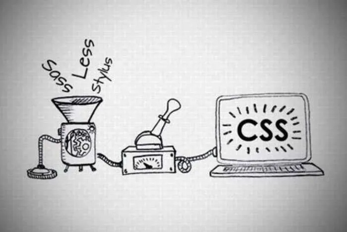
By adopting these tools, developers can write cleaner, DRY code, minimize redundancy, and speed up the styling process, leading to greater efficiency and adaptability across projects.
// Defining reusable variable for the primary color
$primary-color: #3498db;

.button {
   // Apply the primary color to the button's background
   background-color: $primary-color;

   // Nested hover state for the button
   &:hover {
      // Darken the background color by 10% on hover
      background-color: darken($primary-color, 10%);
   }
}
In this example,
- Variables($primary-color) allow easy updates across multiple elements.
- Nesting(&:hover) keeps related styles together.
- Functions(darken()) dynamically adjust values.
-
Power Up with Utilities
Utility classes are single-purpose classes that apply a specific style directly to an element.
They promote reusability, allowing you to quickly and consistently style elements without rewriting or duplicating CSS code. By focusing on one property (e.g., margin, padding, or text-align), utility classes can be applied across multiple components for quick, consistent design.
<div class="u-margin-bottom-small u-text-center">
<p>Sample Text</p>
</div>
In this example,
- .u-margin-bottom-small(applies small bottom margin)
- .u-padding-large(applies large padding)
- .u-text-center(centers text)
By leveraging utility classes, you streamline CSS management, enabling quick adjustments and flexibility, while ensuring your styles remain DRY. This method is beneficial in large projects where repeated styling is needed across different elements.
Utility-first CSS frameworks like Tailwind CSS fully embraces this concept, giving you hundreds of built-in utility classes.
-
Adopt a Naming Convention
Naming conventions are guidelines that assist developers in writing consistent and understandable code.
Some of the popular naming conventions include BEM (Block Element Modifier), SUIT CSS, OOCSS (Object-Oriented CSS), and SMACSS (Scalable and Modular Architecture for CSS).
Choosing or creating a convention that fits your projects plays a crucial part in maintaining a clean and organized codebase.
/* Block */
.card { ... }

/* Element */
.card__header { ... }
.card__body { ... }

/* Modifier */
.card--highlighted { ... }
.card__header--large { ... }
This example uses the BEM convention, where CSS is organized into components (Blocks), their child elements (Elements), and different states (Modifiers).
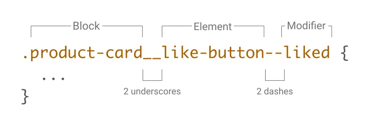
This approach reduces class naming conflicts and makes it easier to identify the function of a class based on its name.
-
Maintain a Design System or Style Guide
Establish a centralized design system or style guide to ensure consistency and streamline development.
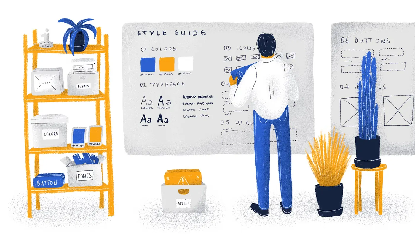
- Components Library: Document all UI components with examples and usage guidelines.
- Style Tokens: Define variables for colors, typography, spacing, and other design elements.
- Documentation Tools: Use tools like Storybookor Styleguidist to create interactive documentation.
-
Documenting Your CSS (Secret to Future-Proof Code)
Clear documentation is crucial for large projects. Leave comments to explain the purpose of complex styles or sections.
It helps future developers (or your future self) quickly understand your reasoning behind certain design decisions.
/* Base button styles */
.button {
  padding: 10px 20px;
  background-color: #3498db;
}

/* Primary buttons are used for main call-to-action */
.button-primary {
  background-color: #e74c3c;
}-
Organizing CSS Files and Folders
As the application grows, disorganized code leads to chaos and breeds disaster. A logical and intuitive file structure simplifies CSS management, ensuring scalability, consistency, and smoother collaboration.
The structure varies based on project requirements. Here’s one example:
/css
  /base
    _reset.css
    _typography.css
    _utilities.css
  /components
    _buttons.css
    _cards.css
    _modals.css
  /layout
    _header.css
    _footer.css
    _grid.css
  /themes
    _dark.css
    _light.css
main.css- Base: Contains global styles like resets, typography, and utility classes.
- Components: House styles for UI components (e.g., buttons, cards).
- Layout: Defines the layout structure of the site (e.g., header, footer, grid systems).
- Themes: Manages different themes or skins for the project.
- css: The main stylesheet that imports all other partials.
This should be sufficient for small-scale projects; however, if further delegation is needed, the option below can also be considered.
/scss/
├── 1- base
│   └── _global.scss
├── 2-design
│   ├── _colors.scss
│   ├── _fonts.scss
│   ├── _breakpoints.scss
│   ├── _spacing.scss
│   └── _typography.scss
├── 2-tools
│   └── _placeholders.scss
│   ├── _aspect-ratio.scss
│   └── _gradients.scss
├── 3-generic
│   ├── _reset.scss
│   ├── _normalize.scss
│   └── _box-sizing.scss
├── 4-elements
│   ├── _headings.scss
│   ├── _buttons.scss
│   ├── _forms.scss
│   └── _lists.scss
├── 5-components
│   ├── _navbar.scss
│   ├── _card.scss
│   ├── _accordion.scss
│   └── _modal.scss
├── 6-layout
│   ├── _grid.scss
│   ├── _header.scss
│   ├── _footer.scss
│   └── _sidebar.scss
├── 7-utilities
│   ├── _helpers.scss
│   ├── _visibility.scss
│   └── _spacing.scss
└── main.scss-
Use Build Tools for Automation

The usage of build tools like Webpack, Gulp, or Grunt to automate repetitive tasks improves development efficiency and consistency.
- CSS Preprocessing: Compile Sass/LESS into CSS automatically.
- Minification: Compress CSS files for faster loading times.
- Autoprefixing: Automatically add vendor prefixes for cross-browser compatibility (via tools like Autoprefixer).
- File Watching: Automatically apply changes in real-time without manual reloads.
- Linting: Check CSS for errors and enforce code style with tools like Stylelint.
- Implement Version Control and Collaboration Practices
Version control systems like Git manage your CSS, track changes, and streamline collaboration.
- Branching Strategy: Use feature branches to isolate work for new components or changes.
- Commit Messages: Write clear and descriptive commit messages related to CSS changes.
git commit -m "Added responsive styles for navigation bar"- Pull Requests and Code Reviews: Implement code reviews to maintain quality and consistency.
Conclusion
Therefore, CSS maintainability often goes unnoticed in the fast-paced world of frontend development until issues arise.
By adopting these best practices, like DRY principles, modular structures, utility classes, and naming conventions, you can build a predictable ecosystem. By leveraging preprocessors and automation tools, you can enhance the workflow. Though initial efforts to adapt and standardize take a considerable amount of time, they immensely pay off as projects grow and evolve.
A maintainable CSS codebase isn’t just easier to manage; it empowers teams to scale confidently, onboard new developers faster, and deliver consistent user experiences with less friction. Think of it as building a solid foundation: the stronger it is, the more effortlessly your UI can grow.
So, whether you’re working solo or in a large team, treat your stylesheets with the same care as your application logic. Maintainable CSS means less hassle, fewer bugs, and faster development—because smart code is happy code!
