
Introduction
It’s often the small things that make the most significant difference. Micro-interactions are a perfect example, as I realized during a recent project. We had a feature that allowed users to download all their uploaded files at once, packaged into a zip folder. Initially, everything worked smoothly, but as the number of files increased, we encountered a challenge: after clicking the download button, users had no immediate feedback on what was happening. Naturally, without any indication that the process had begun, users tend to click the download button repeatedly, thinking it hadn’t started. This led to unnecessary actions and added strain on our backend systems.
To address this, we introduced a simple progress bar for file downloads. This micro-interaction provided real-time updates, showing each step of the process: “Fetching files,” “Downloading files,” “Zipping files,” and finally, “Download complete,” along with a clear progress percentage. The impact was immediate. Users stopped second-guessing, and the repeated clicks reduced, allowing the system to handle the process more efficiently.
This small change made a big difference in both user experience and system performance. In this blog, we’ll explore how micro-interactions like these can be used to improve user experience, making even the smallest tasks smoother and more enjoyable.
What’s Microinteraction?
A microinteraction is a small, subtle design element in an application that helps users interact with it more naturally. These are the little details that provide feedback, guide the user, or make the experience more engaging. For example: When you’re using WhatsApp, Instagram, or even Microsoft Teams, you see the “typing…” indicator while someone is responding to your message; that’s a microinteraction. It reassures you that the other person is actively engaged in the conversation, making the chat feel more connected and real-time.

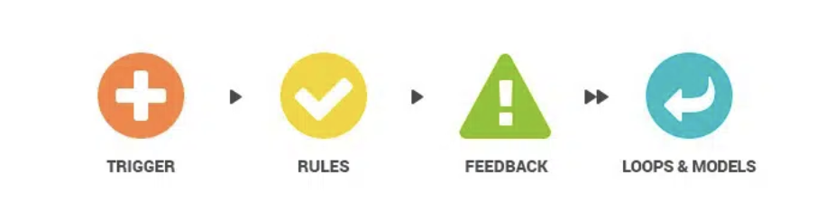
Key Components of Microinteraction
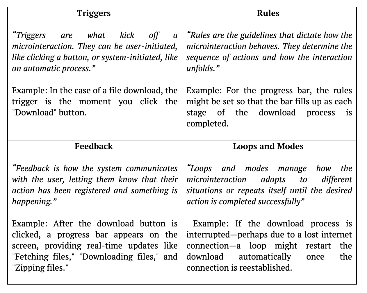
There are four key components that make a microinteraction effective. Let’s explore these components using the example of a progress bar for file downloads.
Examples of Microinteraction
1. Preloaders
One of my favorite examples of microinteractions is the use of preloaders. These dynamic loading screens not only inform users that an application is working behind the scenes but also present a valuable opportunity to engage with them. Preloaders can be more than just a waiting indicator—they can offer useful tips, share interesting app details, or even reflect your brand’s unique voice.
Example: In the Ajio app, the preloader features a dynamic display of different types of attire, while Zomato uses its preloader to showcase entertaining food-related quotes. These examples illustrate how preloaders can be tailored to fit the theme of your application, making the waiting time feel more engaging and relevant.

Tip: When designing or choosing a preloader, ensure it aligns with your app’s purpose. A food-themed preloader wouldn’t make much sense in a clothing app, and vice versa.
2. Tooltips
Tooltips are incredibly helpful for making user interfaces more understandable. They give users extra information about what different buttons or icons do, which can be especially useful when only icons or short labels are used.
For example, if you have a trash can icon that deletes something, a tooltip saying “Delete this item” will let users know exactly what will happen if they click it. Similarly, for a “+” button used to add something, a tooltip like “Add new item” can make it clear what the button does.

You can add simple tooltips in HTML with the `title` attribute or create more customized ones with CSS and JavaScript. This way, tooltips can fit various designs and help users feel more confident about their actions.
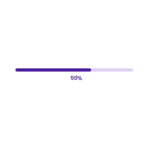
3. Progress bars
Progress bars provide a clear visual representation of task progress, helping users understand how long they might have to wait and making lengthy processes feel shorter. By incorporating engaging visuals or animations, progress bars also keep users informed and interested, ensuring a smoother and more satisfying experience.
Overall, progress bars are vital for offering real-time feedback and making interactions more intuitive and enjoyable.

Example: During form filling, a step progress bar guides users through the completion stages of a multi-step form. In project management tools like JIRA, a linear progress bar visually represents the completion status of tasks or stories.
4. Form Validation
Form validation is a crucial micro-interaction that provides users with immediate feedback on the validity of their input. For instance, if a user enters an invalid date or email or forgets to check a required checkbox, real-time validation alerts them to these issues. Additionally, password strength validation enhances the user experience by guiding users toward creating secure passwords.
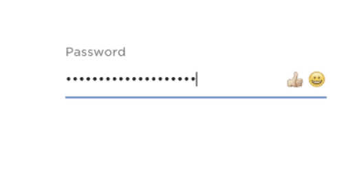
For example, when a user types their password, an indicator could show whether their password is weak, moderate, or strong, along with tips for improvement.
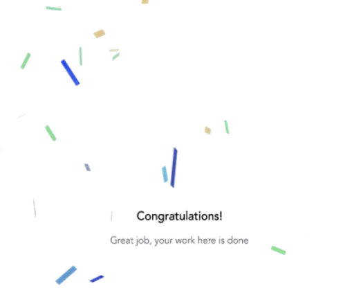
5. Confetti
Confetti is a fun way to celebrate when users complete tasks. For example, on coding platforms, when we finish completing a code and see confetti burst across the screen, it makes us feel like great coders—even if it’s just a simple print statement! This joyful celebration boosts our energy and encourages us to keep coding. It provides instant feedback and makes us feel good about our achievements. Overall, these small celebrations turn ordinary tasks into happy moments, increasing user satisfaction and loyalty.
Importance of Microinteraction
- Improved User Experience: Microinteractions make your application feel more engaging. A simple animation or feedback can guide users, making interactions smooth and enjoyable.
- Clear Communication: They help communicate what’s happening without needing extra text or explanations. For instance, a subtle shake when a password is wrong or immediately showing users appropriate feedback tells the user something’s off.
- Increased User Satisfaction: These small details create a sense of delight. When users feel like the product “gets them,” they’re more likely to enjoy using it.
- Reinforcement of Brand Identity: Microinteractions can be tailored to fit your brand’s personality, making the overall experience more cohesive and memorable.
Drawbacks of Missing Microinteractions: A Case Study
Background
A popular messaging app faced challenges with user engagement and retention. While users appreciated the app’s core features, feedback indicated that many felt disconnected during conversations, leading to frustration and dropped chats.
Challenge
Users were unaware if their messages were being sent or received, leading to repetitive sending, frustration, and potential miscommunication.
Solution: Implementing Microinteractions
- Typing Indicators: Introduced a real-time “typing…” indicator that displayed when the other person was actively responding.
- Message Sent/Received Feedback: Implemented checkmarks to indicate when messages were sent (single check) and delivered (double check). This visual cue provided reassurance to users about their message status.
- Read Receipts: Added a feature where users could see when their messages were read, fostering transparency in communication.
- Notification Sounds: Incorporated notification sounds when a message was received, enhancing the awareness of incoming messages without being disruptive.
Results
- Increased User Engagement: The introduction of typing indicators and message feedback significantly improved user engagement. Conversations felt more dynamic, encouraging users to stay in the app longer.
- Higher Retention Rates: Users reported feeling more connected, leading to improved retention rates. Feedback indicated a more satisfying communication experience.
- Reduced Redundant Actions: With clear feedback mechanisms in place, users were less likely to send repeated messages, easing strain on the app’s backend and improving overall performance.
This case study demonstrates how thoughtfully designed microinteractions can enhance user experience, increase engagement, and address specific challenges in app usability. By focusing on user feedback and iterating on microinteractions, the messaging app not only improved satisfaction but also fostered a stronger sense of community among its users.
Best practices for microinteraction
- Microinteractions work best when they help users without confusing or distracting them. Striking the right balance is important—too many can overwhelm users and slow down app performance.
- For instance, if every button press triggers an animation, it can feel overwhelming and unnecessary. Instead, use animations for high-impact actions, such as submitting a form or completing a task.
- Use microinteractions selectively in high-impact areas like form submission feedback or loading indicators. Test their effectiveness with user feedback to ensure simplicity and functionality.
- Microinteractions can make applications more inclusive by addressing the needs of users with diverse abilities.
- Vibration or subtle buzz on mobile devices during interactions, like failed actions or button presses, helps users with visual disabilities.
- Allow users to disable animations if they have motion sensitivities. You can implement a toggle switch to enable or disable all animations.
- Ensure progress bars or feedback animations include text descriptions for users relying on screen readers or who are color blind.
- Use CSS animations instead of heavy graphics. For instance, a smooth fade-in for notifications ensures quick loading without slowing down the app.
- When transitioning between pages, use a subtle slide effect. This visually connects the two pages and enhances the sense of continuity in the user journey.
By thoughtfully designing microinteractions with clarity, balance, and accessibility in mind, you can create a user experience that is intuitive, inclusive, and engaging without overwhelming the user.
How to get started?
-
Identify Key User Actions:
Start by taking a close look at your application to identify critical user actions. For example, think about actions like submitting a form, making a purchase, or uploading a file. Tools like Hotjar can help you analyze user behavior and pinpoint these key actions.
-
Define the Purpose:
Once you’ve identified those actions, clarify what you want each microinteraction to accomplish. Are you aiming to provide instant feedback, guide users through a process, or simply enhance engagement? Check out Nielsen Norman Group’s article on microinteractions for deeper insights.
-
Choose Appropriate Elements:
Decide which microinteraction elements will best suit your app. For instance, use progress bars for uploads, tooltips for clarification, or even fun confetti animations for celebratory moments. Below are some great resources to help you find inspiration and ready-to-use elements: Lottie, Dribbble, and Preloader.net.
-
Create Prototypes:
Bring your ideas to life with prototyping like Figma, Sketch, or Adobe XD. Create low-fidelity mockups to visualize how these microinteractions will fit into the user journey. This step is important for testing your concepts before full development.
-
Test with Users:
User testing is key! Gather a group of users and observe how they interact with your microinteractions. Do they find them helpful? Do they create any confusion? Tools like UsabilityHub can facilitate this process by allowing users to provide feedback on your designs.
-
Iterate and Refine:
Based on the feedback you collect, refine your microinteractions. Make adjustments until they feel intuitive and seamless. This iterative process ensures that you’re meeting user needs effectively. Check out this guide on iterative design for further strategies.
-
Stay Updated:
The world of design is constantly evolving, so stay updated on the latest trends and user preferences. Engage with design communities on platforms like Twitter or Medium to keep your knowledge fresh and ensure your application remains engaging.
Conclusion
To wrap it up, microinteractions might be small, but they make a big difference. They guide users, provide instant feedback, and make your application feel more personal. While these little details are powerful, they should be implemented carefully to ensure they don’t cause any performance lag. When done right, they create a better, more enjoyable experience for everyone.
Happy Coding!
