
-
A microsite built directly from a meeting transcript often becomes too text-heavy and tries to do the job of a presentation deck.
-
Decks are best for scannable information such as scope, objectives, risks, team structure, and commercial details.
-
Microsites add the most value when clients can make live decisions, edit assumptions, test scenarios, or preview deliverables.
-
The strongest approach combines a concise PowerPoint with an interactive microsite designed around one or two meaningful client moments.
Give a consulting team a Claude subscription and a Teams meeting transcript, and within an hour they can hand you a working HTML microsite. That speed is real, and it’s starting to change how teams default to building client materials: a discovery call happens, someone runs the transcript through an LLM, and out comes a page. It looks impressive, it’s fast, and it reads as “AI-forward.” It’s also usually the wrong output — a microsite built straight from raw meeting minutes tends to over-populate with text, paragraph after paragraph restating what was said, because that’s what a transcript gives you.
What a client actually needs after a discovery call is what a PowerPoint has always been good at: three lines under “What We Heard,” a clean “Project Objectives” slide, a scope line that’s easy to mark up in real time when the client pushes back. The problem isn’t Claude. It’s applying the same instinct — “claudify it” — to every deliverable, regardless of what that deliverable is actually for.
Why a Microsite Isn’t a Deck
A slide deck is built to be scanned, forwarded, and annotated without anyone narrating it. A microsite is built to be experienced — clicked through, interacted with, ideally with someone in the room walking it live. Conflating those two jobs is exactly where the over-population problem comes from: teams make the microsite do the deck’s job (convey scope and structure as text) instead of the job only a microsite can do (let someone click, edit, and watch something respond).
I tested that distinction on two builds: a nine-week engagement storyboard for a downselect presentation to a large academic medical center, and a live TCO/ROI working model for a working session with a university client. Neither replaced the proposal deck. Both did something the deck genuinely couldn’t.
Two Builds That Taught Me Where the Line Is
I didn’t take this on faith — I built both, end to end, and watched what happened in the room. What that proved, in practical terms:
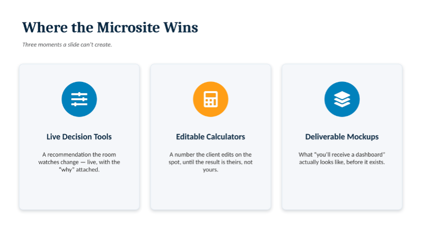
- A live decision beats a described one. In the academic medical center engagement, two “tabletop moments” were built directly into the storyboard — a workload-placement planner and a governance escalation tool. The room made the call themselves before I revealed the system’s recommendation; watching it change live, with a visible “why,” did more than any methodology slide could.
- A number the client can argue with is a number they trust. In the university client’s TCO/ROI model, every cost line and retention assumption was a live, editable field. When their own stakeholder corrected my dollar-per-retention-point estimate and watched the ROI multiple recalculate instantly, the number stopped being “Presidio’s” and became theirs.
- Deliverable mockups answer “what do we actually get” better than a paragraph does. Illustrative dashboard mockups — a capacity planning view, a cloud placement matrix, a threat-model scorecard — made the intangible tangible in a way “you’ll receive a capacity planning model” on a slide never could.
- It forces a governance decision before the client asks for one. Building a genuine human-in-the-loop override into the workload-placement tool meant deciding, in advance, exactly how much control the client keeps over an AI-generated recommendation — a conversation most teams have reactively, if they have it at all.
- It’s a tool that outlives the meeting, and it has a real operational risk a slide deck never has. The client keeps the planner and calculator running long after the meeting ends — but both only pay off if they’re run live, in one browser session; skip a step or switch laptops mid-presentation and the live summary at the end comes up empty. Worth planning the run-of-show around, not a reason to avoid the tool.
Where the Microsite Wins
A microsite earns its place on a live decision, an editable number, or a preview of the deliverable itself — exactly where a static deck runs out of ways to say “trust us.”
Where the Deck Still Wins
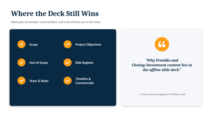
The academic medical center storyboard shipped with its own presenter talking script, explicit about this boundary: “Why Presidio and Closing/Investment content live in the offline slide deck.” Those categories share a trait the tabletop moments and calculators don’t — they need to be scanned in ten seconds, forwarded without a link, and marked up in a follow-up email. A bulleted slide does that job; a paragraph of prose on a webpage doesn’t, no matter how well the page is built.
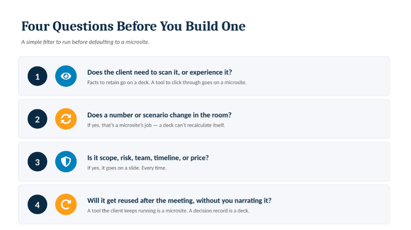
A Simple Filter: Four Questions Before You Build One
Claudify the Right Layer
None of this argues against building microsites — both examples above are proof they’re worth the build time. The argument is against claudifying the whole presentation because claudifying the right piece of it worked so well. Pair a tight, bulleted PPT — scope, objectives, risks, team, commercials — with a microsite that carries the one or two moments a client needs to click through or argue with. That combination is what moved the room in both engagements, not one format alone.